About the project

Visualizations are ubiquitous tools for communicating data, both within science and the popular 
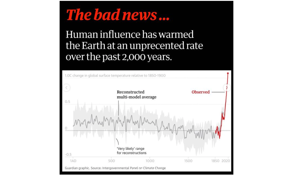
media. Urgent messages with immediate effects on public life, i.e. the exponential growth of COVID-19, are often communicated via charts or diagrams. It is not clear whether public interpretations of these visualizations match the messages their creators aim to convey. The same is true for data visualizations in science; it is not a given that experts will interpret them the way they are intended.

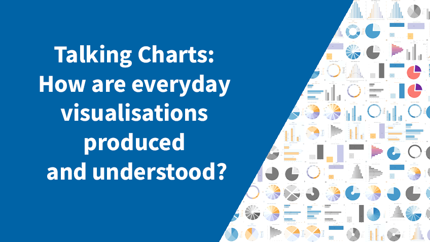
How do visualization producers create, and consumers understand, the messages carried in visualizations? How do consumers come to trust or to distrust, to act on or to ignore them?

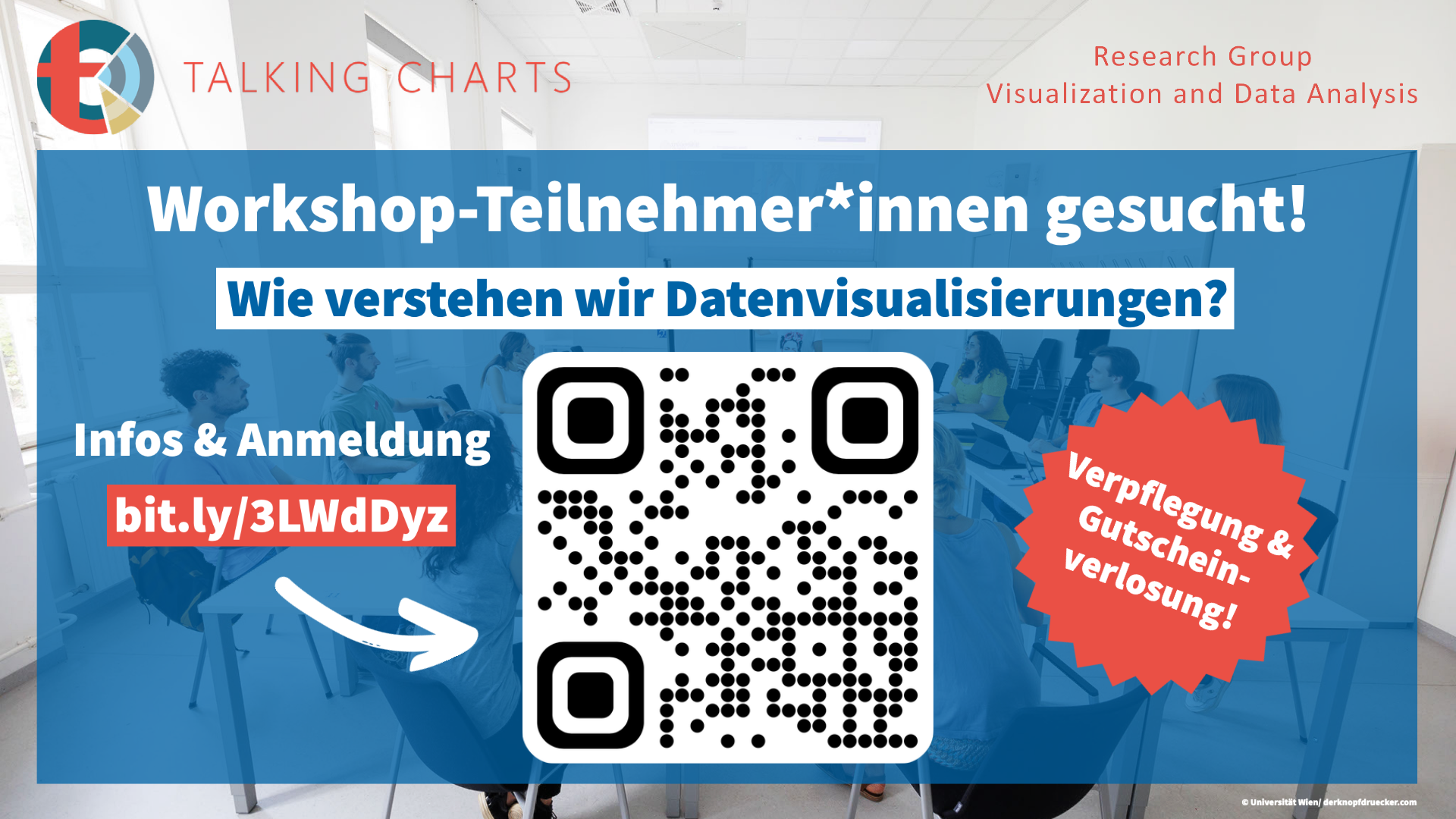
Talking charts is a mixed-methods project exploring how people encode, understand and engage with the messages (and implicit assumptions) communicated by data visualizations, particularly those focusing on COVID-19 and climate change. The project team, with expertise in computer science and science & technology studies, will study and work with members of two case studies: 1) journalists and their readership and 2) researchers in the natural sciences, to develop and co-create tools and guidelines facilitating visual data understanding. We take actual practices of visualization production and sensemaking as a starting point to inform and intervene into design, while at the same time seeking to foster dialogue between visualization producers and consumers.

News

Paper on Climate Vis Accepted for Publication

We are thrilled to share that Regina Schuster’s paper, titled “Being Simple on Complex Issues” – Accounts on Visual Data Communication about Climate Change, has been accepted for publication in the IEEE Transactions on Visualization and Computer Graphics (TVCG) journal in 2024!
Read more

Workshop on Social Media Visualization at FMS im Zentrum

On June 15th, Laura Lotteraner, Regina Schuster, and Judith Staudner hosted a workshop on visualizing social media data at FMS im Zentrum, a public school in Vienna."
Read the blog post

Talk by
Jen Christiansen

On Sept. 01, 10:30 - 11:30 a.m., Jen Christiansen of Scientific American will give a talk on "Special Considerations for Science Graphics (from a journalist's point of view)."
More info

Congratulations, Timothée Schmude!

Timothée Schmudes paper “On the Impact of Explanations on Understanding of Algorithmic Decision-Making” was accepted at ACM FAccT 2023! On the 14th of June, Timothée will present the paper at the conference’s venue in Chicago.
Read more

Congratulations,
Regina Schuster!

Regina just presented her paper “'The main message is that sustainability would help' -- Reflections on takeaway messages of climate change data visualizations" at the CHI 2023 Workshop on HCI for Climate Change: Imagining Sustainable Futures in Hamburg.
Read more

Workshop:
Call for participants!

We are looking for participants for our workshops!
More details (in German)

Welcome,
Christian Knoll!

We are very pleased to announce that Christian Knoll has joined the Talking Charts project as a PhD candidate!

Connecting the Dots...

On September 21st we hosted our first Talking Charts Team Workshop.
Read Blogpost

Welcome Regina Schuster!

We are excited that Regina Schuster has joined our team as a PhD candidate!

Talking Charts @ Data Stories

On May 23rd Laura Koesten and Kathleen Gregory will be giving a talk on "Talking Charts: How are everyday visualisations produced and understood?"
Find out more

Come work with us!

We are hiring for six exciting new PhD positions at the University of Vienna, Austria.
Go to job posting

Coming soon!

The Talking Charts project will be starting on the 1st of November 2021.
View Details

Welcome Kathleen Gregory!

We are happy that Kathleen Gregory has joined our team at the University of Vienna!

Team

Laura Koesten - Project Lead

Laura Koesten is a Postdoc at the University of Vienna in the Research Group for Visualization and Data Analysis and an external researcher at King’s College London, UK. In her research, she is looking at ways to improve human-data interaction by studying sensemaking with data and visualisations, data discovery and reuse, as well as collaboration in data science. That means she researches how data is used, understood and presented by different user groups. She obtained her Ph.D. at the Open Data Institute in London and the University of Southampton, UK.

Kathleen Gregory

Kathleen Gregory is a postdoctoral researcher at the University of Vienna and a research fellow at the Scholarly Communications Lab at the University of Ottawa, Canada. She holds a PhD in in Science &Technology Studies and has a MSc in Library and Information Science and an MA in Education. Her research focuses on data practices and scholarly communication, examining how people manage, communicate, understand and use data in academia and public life.

Torsten Möller

Torsten Möller is a professor of computer science at the University of Vienna, Austria, since 2013. Between 1999 and 2012 he served as a Computing Science faculty member at Simon Fraser University, Canada. He received his PhD in Computer and Information Science from Ohio State University in 1999 and a Vordiplom (BSc) in mathematical computer science from Humboldt University of Berlin, Germany. He is a senior member of IEEE and ACM, and a member of Eurographics. His research interests include algorithms and tools for analyzing and displaying data with principles rooted in computer graphics, human-computer interaction, signal processing, data science, and visualization.

Sarah Davies

Sarah R. Davies is Professor of Technosciences, Materiality, & Digital Cultures at the Department of Science and Technology Studies, University of Vienna. Her work explores how science and society are co-produced – how society defines the conditions of scientific research, and how science is present in wider society. The ‘red thread’ of the digital and digitisation runs throughout. She has written about hackers and hackerspaces, how scientists experience the conditions of contemporary academia, and science communication formats such as science festivals or museums. Her recent work includes the books including Hackerspaces (2017, Polity), Science Communication (2016, Palgrave, with Maja Horst), and Exploring Science Communication (2020, SAGE, with Ulrike Felt).

Regina Schuster

Regina Schuster is a PhD student at the University of Vienna in the Research Group for Visualization and Data Analysis. She obtained her MSc in Business Informatics at the University of Vienna and her BSc in Business Administration and Human Resource Management and Education at the Ludwig-Maximilians-Universität Munich. She is interested in how data visualizations are used in everyday news sources and how people make sense of them.


Christian Knoll

Christian Knoll is a PhD student at the University of Vienna in the Research Group for Visualization and Data Analysis. His interest and research focus is on data visualization and human-computer interaction. In his prior interdisciplinary project, he explored, implemented and evaluated design options for visual analysis systems of high-dimensional data. He conducted several creative visualization-opportunities (CVO) workshops in which the design space of visualizations was explored in collaboration with domain experts.

Collaborating organisations and projects

Our Work

Publications

Project publications:

  • Koesten, L., Gregory, K., Schuster, R., Knoll, C., Davies, S., & Möller, T. (2023).
    What is the message? Perspectives on Visual Data Communication.
    Preprint: https://doi.org/10.48550/arXiv.2304.10544
  • Prantl, V. I., Moeller, T., & Koesten, L. (2023).
    Passionate Charts: Arguments for Empathetic Emotions in Data Vis.
    Preprint: https://doi.org/10.48550/arXiv.2304.10540
  • Schuster, R., Koesten, L., Gregory, K., Möller, T. (under review as of September 2022).
    "Being Simple on Complex Issues" – An expert view on visual data communication of climate change.
    Preprint: https://doi.org/10.48550/arXiv.2211.10254
  • Schuster, R., Koesten, L., Gregory, K., Möller, T.
    “The main message is that sustainability would help” – Reflections on takeaway messages of climate change data visualizations change.
    Preprint: https://doi.org/10.48550/arXiv.2305.04030

  • Prior publications related to the project:

    • Laura Koesten, Kathleen Gregory, Paul Groth, Elena Simperl.
      Talking datasets – Understanding data sensemaking behaviours.
      International Journal of Human-Computer Studies, Volume 146, 2021, 102562, ISSN 1071-5819.
      https://doi.org/10.1016/j.ijhcs.2020.102562
    • Laura Koesten, Emilia Kacprzak, Jeni Tennison, Elena Simperl.
      Collaborative Practices with Structured Data: Do Tools Support What Users Need?
      In Proceedings of CHI Conference on Human Factors in Computing Systems (CHI '19), May 4–9, 2019, Glasgow, Scotland UK. ACM, New York, NY, USA.
      https://doi-org.uaccess.univie.ac.at/10.1145/3290605.3300330

Contact

Reseach Group Visualization & Data Analysis
University of Vienna
Sensengasse 6, 1090 Vienna